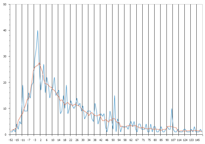
Consider a chart with a trend that might be quite jagged across data points (blue line).
What if you would like a smoother version of that line - a moving average, if you will (red line). This stabilises the results, like looking at climate vs weather.
It's fairly easy from a SQL point of view - in this case it's another column in the original chart query
The third column uses an analytical function to calculate the average of the 6 surrounding counts at any given point on the x-axis. The "rows between" syntax is often left to the default, which is everything up to the current value (see post comments), based on the order provided. In this case it explicitly specifies the 'window' of rows to average to be only nearby data points.
Note this report looks a lot cleaner with display setting 'Marker' using 'None', as opposed to 'Circle'.
Nice, simple way of providing the user information that can be easier to read & interpret.
What if you would like a smoother version of that line - a moving average, if you will (red line). This stabilises the results, like looking at climate vs weather.
 |
| Oracle APEX Line Chart - 2 series |
SELECT null lnk
  ,diff   label
  ,count(*) AS qty
  ,round(avg(count(*)) over (order by diff rows
                             between 3 preceding and 3 following)
        ,2) AS moving_avg
...
The third column uses an analytical function to calculate the average of the 6 surrounding counts at any given point on the x-axis. The "rows between" syntax is often left to the default, which is everything up to the current value (see post comments), based on the order provided. In this case it explicitly specifies the 'window' of rows to average to be only nearby data points.
Note this report looks a lot cleaner with display setting 'Marker' using 'None', as opposed to 'Circle'.
Nice, simple way of providing the user information that can be easier to read & interpret.


