Last year I described a simple test case that described how to remove outliers from a fictional dataset using the STDDEV() analytical function .
http://www.grassroots-oracle.com/2017/06/removing-outliers-using-stddev.html
I want to follow this up with a practical case using one of my favourite data sets - the apex_workspace_activity_logs that record who opened what page, in what context, and how long it took to generate.
I've been keeping an eye on the performance of a particular page, after making a few performance adjustments to some conditions. Unfortunately, we had an unrelated anomaly that pushed average pages times quite high for a short period. Needless to say, this set of outliers transformed my beautiful performance indicating lines to a boxy bell curve.
A great feature with Oracle JET is the ability to hide certain series, on click within the legend.
In this case I just wanted to ignore the MAX line for this post, which in this chart forms the secondary y-axis.
Our clients really enjoy this particular feature (so do I), so thanks to the JET team for building such a device, and the APEX team for integrating it.
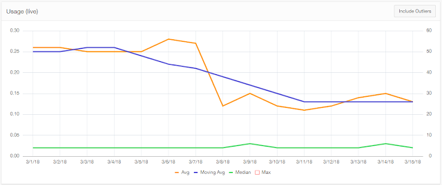
This graph shows results where I modified the query to filter the outliers, on demand.
Looks like the adjustments to the conditions worked! The trend is downwards.
I tried a few variations to control the switch, but this seemed to perform the most predictably, although I'm not happy with the hardcoded number.
Happy graphing!
http://www.grassroots-oracle.com/2017/06/removing-outliers-using-stddev.html
I want to follow this up with a practical case using one of my favourite data sets - the apex_workspace_activity_logs that record who opened what page, in what context, and how long it took to generate.
I've been keeping an eye on the performance of a particular page, after making a few performance adjustments to some conditions. Unfortunately, we had an unrelated anomaly that pushed average pages times quite high for a short period. Needless to say, this set of outliers transformed my beautiful performance indicating lines to a boxy bell curve.
 |
| Oracle APEX page performance data with extreme outlier |
A great feature with Oracle JET is the ability to hide certain series, on click within the legend.
In this case I just wanted to ignore the MAX line for this post, which in this chart forms the secondary y-axis.
 |
| OracleJET Region Attributes - rescale |
This graph shows results where I modified the query to filter the outliers, on demand.
 |
| Performance graph with outlier removed |
Looks like the adjustments to the conditions worked! The trend is downwards.
I tried a few variations to control the switch, but this seemed to perform the most predictably, although I'm not happy with the hardcoded number.
select [aggregate stuff]I have a generic example of this on livesql.oracle.com I pay attention to these aggregates for our performance reports
from (
select [all columns]
,case when :P23_IGNORE_OUTLIERS = 'Y' then
-- only bother calculating when filtering them out
stddev(elapsed_time) over (order by null)
else
9999999
end as the_stddev
from [activity logs]
where [time/page is desired]
)
-- only when elapsed time less than 2 standard deviations gets 95% of your data
where (elapsed_time < 2*the_stddev )
- Median - what most users are experiencing
- Average - a typical user experience, influenced by extremes
- Moving average - general trend of visits, spread over a few days. An attempt to normalise local events
- Max - what's the worst some people are experiencing?
Happy graphing!